
ClearEdge
ReBrand
Client: ClearEdge
Role: Creative Director/Designer
Services: Visual Strategy & Visual Identity
URL: meetclearedge.com
The ask: ClearEdge, a 16-year-old marketing company, was expanding its lines of business and needed a refreshed visual brand to reflect its growth and evolving company values. The new identity needed to capture the company’s momentum, forward-thinking approach, and an overarching theme of optimism.
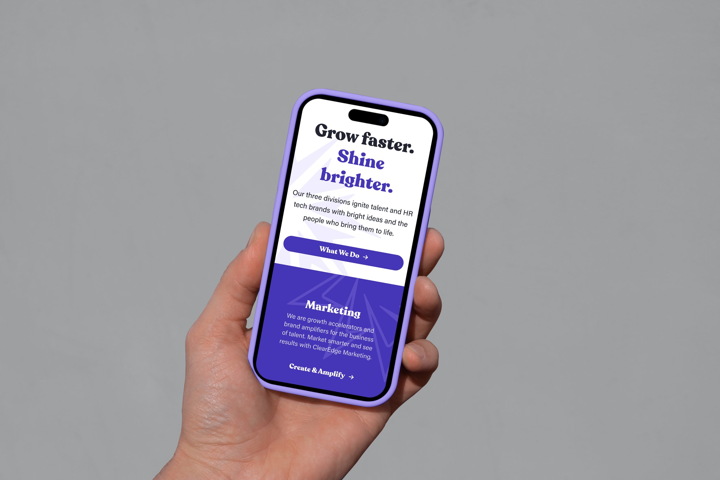
The design solution: I led the development of a new visual identity that embodied growth and optimism through a refined color palette, dynamic typography, and an evolved brand mark. Bright, energetic hues replaced the previous darker tones, reinforcing a sense of momentum and opportunity. The updated design system featured clean, modern layouts and uplifting visual elements that reflected ClearEdge’s commitment to innovation and progress. Additionally, we introduced a more engaging digital presence, ensuring the brand's energy translated seamlessly across web, social media, and client-facing materials.
The outcome: The rebrand successfully positioned ClearEdge as a company on the rise—one that embraces change and new opportunities. Internally, the refreshed identity helped unify and inspire teams, while externally, it signaled a bold new chapter to clients and industry partners. The new visual language strengthened brand recognition, enhanced ClearEdge’s credibility, and ultimately supported the company’s business expansion efforts.
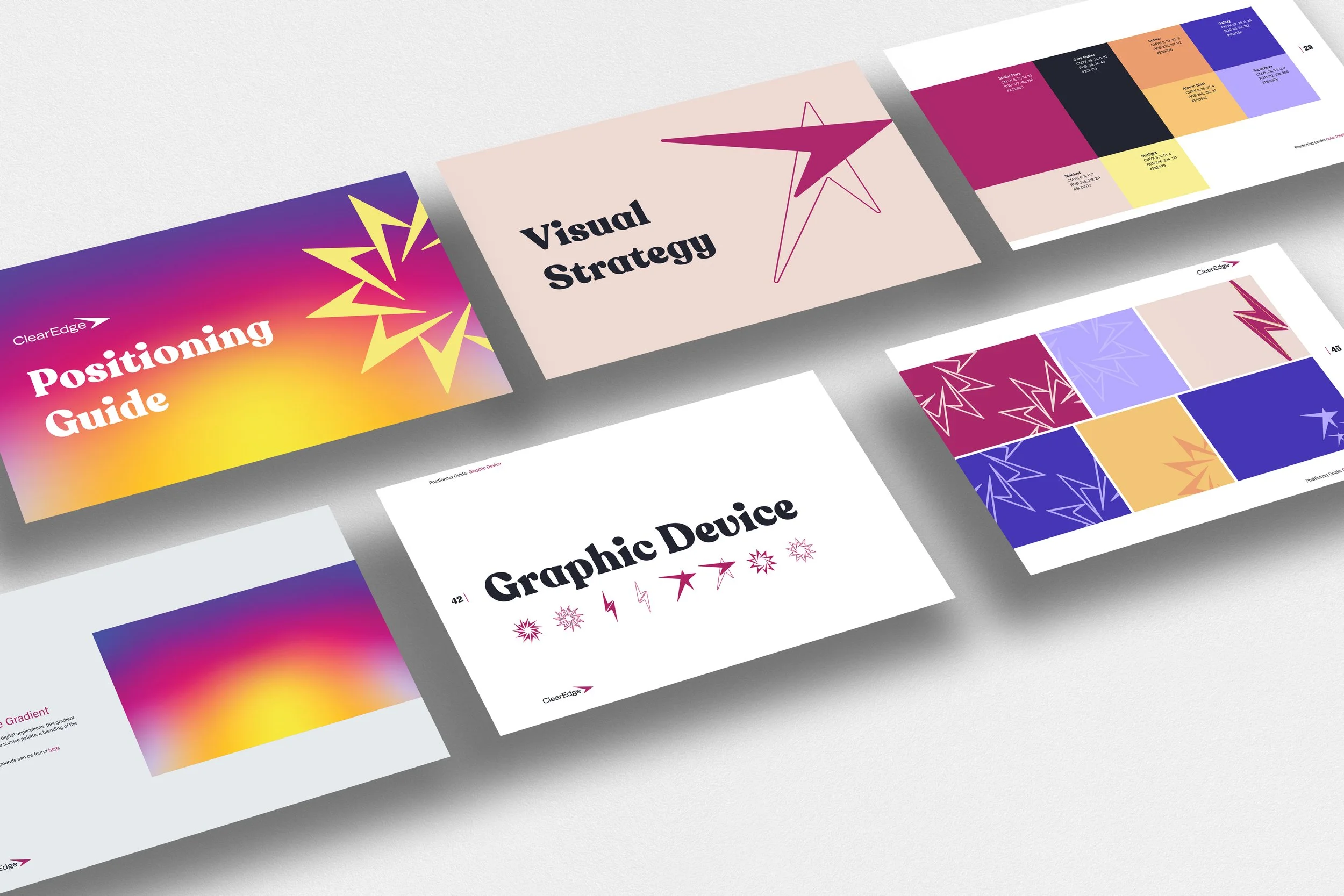

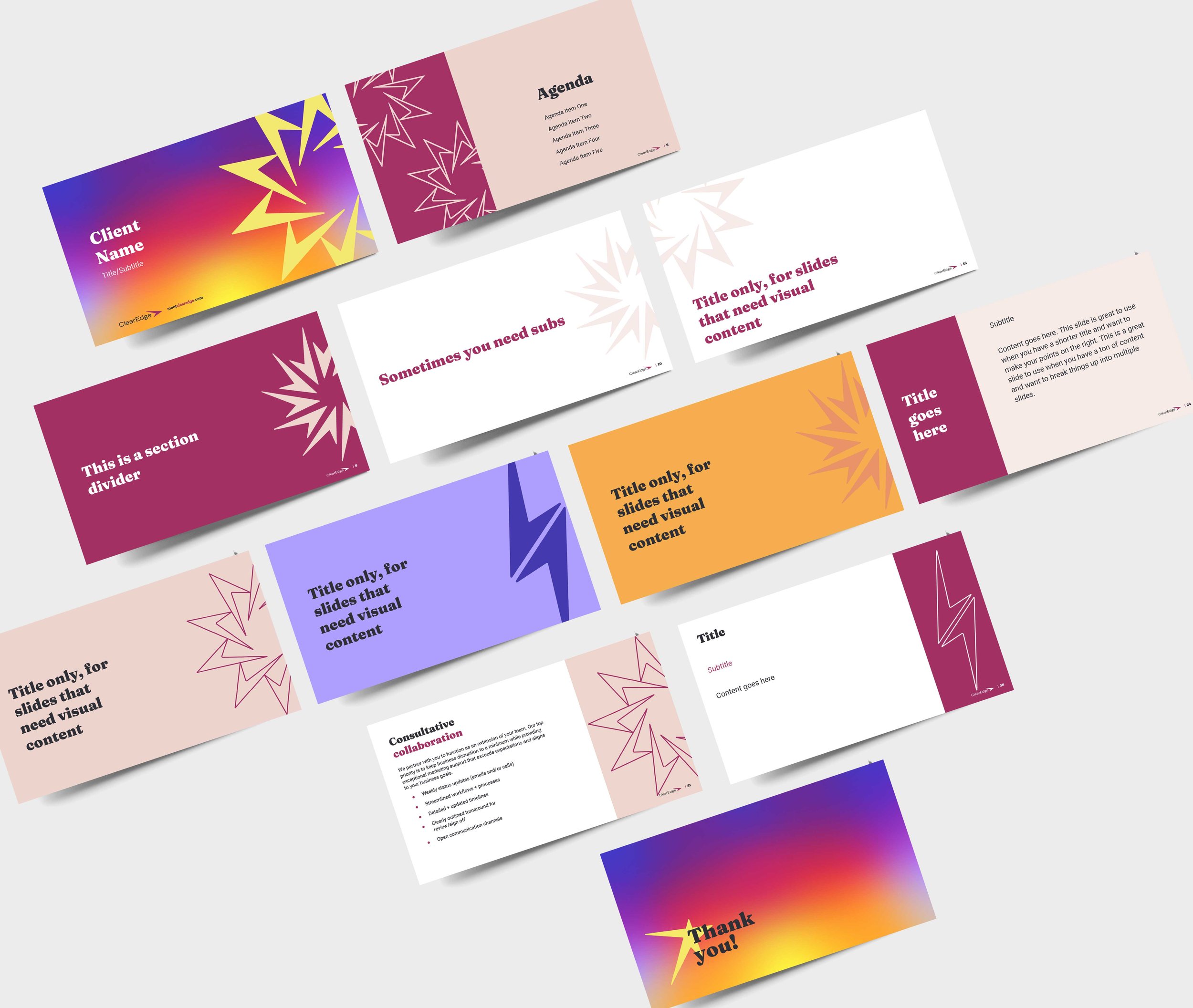
The new ClearEdge brand features custom graphics that serve as the core of its visual identity. These graphics are inspired by the arrow in the logo, which acts as the foundation for creating a variety of recognizable patterns and configurations.
Designed as a visual shorthand, they help build brand awareness and recognition. The graphics also symbolize ClearEdge’s connectivity and transformation while offering creative flexibility in their application.
